Reading your Overview dashboard
The Overview answers one question: is your brand getting more or less visible in AI answers? Everything on it is measured over a rolling window, 14 days by default.
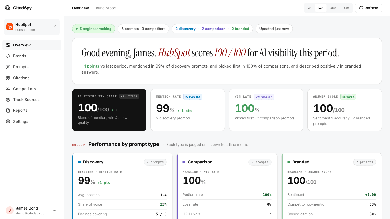
The four cards at the top
Each card covers a different prompt type, so each divides by a different number.
AI visibility score
One blended figure, built entirely from the other three cards. It exists so you can glance at a single number and know whether things are improving.
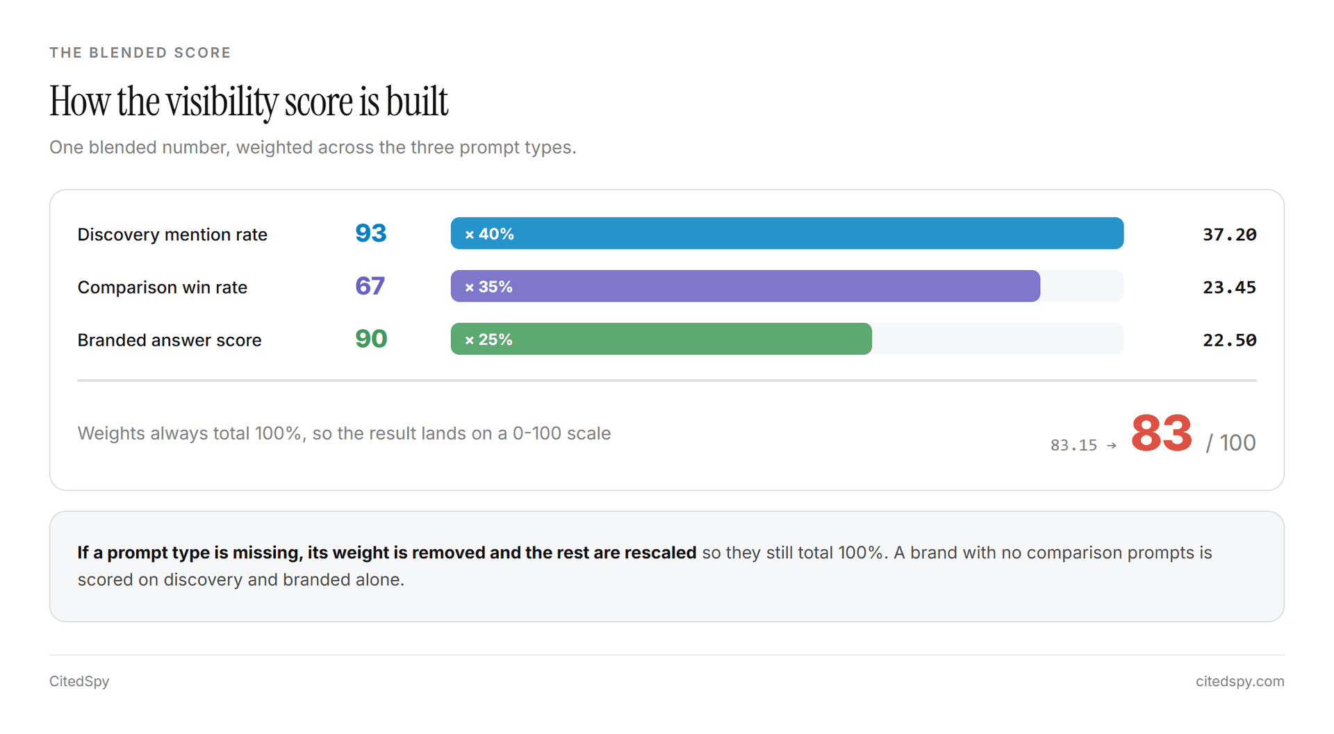
Visibility = (0.40 x Discovery mention rate)
           + (0.35 x Comparison win rate)
           + (0.25 x Branded answer score)
Discovery carries the most weight because being found in unbranded questions is the hardest and most valuable outcome. If you have no prompts of a given type, that term is removed and the remaining weights are rescaled so they still total 100%.
Worked example. A brand scoring 93 on discovery, 67 on comparison and 90 on branded:
0.40 x 93  = 37.20
0.35 x 67  = 23.45
0.25 x 90  = 22.50
             ------
             83.15  ->  shows as 83
Mention rate
How often you get named when someone asks an unbranded question in your category.
                brand mentions in discovery runs
Mention rate =  --------------------------------  x 100
                     total discovery runs
Comparison and branded runs are deliberately excluded. Being named in your own branded prompt proves nothing about visibility.
Win rate
When an AI is asked to compare you against rivals, how often it picks you as the winner. This comes from the AI judge's verdict, not from word order.
             comparison runs where the judge picked you
Win rate =   -----------------------------------------  x 100
                comparison runs the judge scored
Runs where the judge could not produce a verdict are excluded from both halves of the fraction rather than counted as losses.
The caption "Ranked #1" describes what win rate means - the share of runs where you were picked first. It is not a live ranking of your brand.
Answer score
When someone asks about you directly, how good the AI's answer is. The judge scores factual accuracy, completeness and clarity together, out of 100, and is told to be conservative: around 60 is adequate, 30 or below is poor.
The change arrows
Every card compares against the equally long window immediately before this one.
Change = this window's value - previous window's valueAn arrow only appears when the difference is not zero, so there is no "flat" state on these cards. If you have no data at all in the prior window, all arrows are hidden - a brand's first ever 83% should not read as "+83 points".
Charts and trends
Mention rate over time plots one line per company, using discovery runs only. Days with no runs show no value at all rather than zero, because we do not run every prompt every day. A zero would read as "we disappeared", which would be wrong.
Win rate over time does the same for comparison verdicts. All the lines share one denominator, so together they total 100% or less. The shortfall is genuine ties.
Per-engine win rate is usually the most actionable breakdown on the page. It is common to see one engine strongly favour you while another is neutral, on the very same prompts.
The tracked prompts table
One row per prompt. The result column changes meaning by prompt type: discovery rows show mention rate, comparison rows show win rate, branded rows show answer score out of 100.
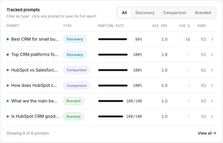
The change column uses a small deadband: a move of more than 2 points shows up or down, anything smaller shows a flat dot.